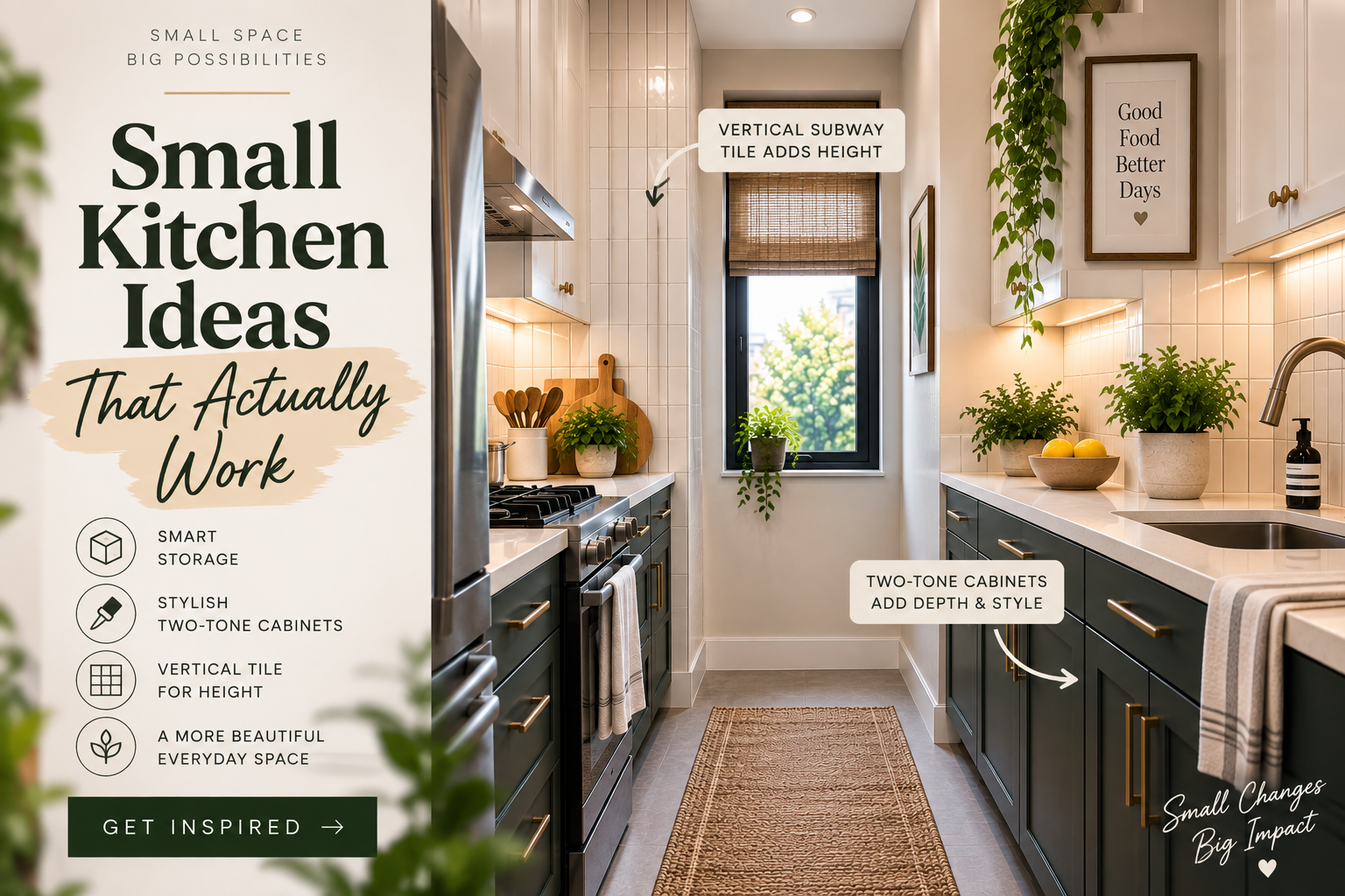
Small Kitchen Ideas That Actually Work (Not Just Photos)
Disclosure: this post contains affiliate links. If you buy something through one, I may earn a small commission at no extra cost to you.
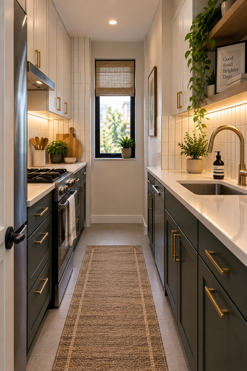
The kitchen in my second apartment was 61 square feet, and for the first year I owned it I genuinely thought the problem was the size. Every cabinet, upper and lower, was the exact same builder-grade white. Same hardware everywhere. One flush ceiling fixture that turned everything under it a flat, slightly greenish white by evening.
I tried to fix it with objects. A better dish rack. A hanging pot rail I never actually used. Two different plants that didn't survive the low light near the one small window. None of it changed how the room felt, because none of it touched what was actually wrong every surface in that kitchen was the same tone, lit the same flat way, and a room like that reads as small no matter how much square footage it technically has.
It took repainting the lower cabinets one weekend, years later, to prove that theory to myself. The layout hadn't changed by a single inch. The kitchen looked bigger anyway.
The principle underneath everything else
Contrast creates depth, and depth is what makes a small kitchen read as larger than it measures.
An all-one-tone kitchen gives your eye nothing to judge distance by. Every wall, cabinet and surface blends into the next, and a room with no depth cues reads as flat and boxed-in regardless of the actual square footage on the listing.
Everything below is a version of putting contrast back in: between upper and lower cabinets, between wall and ceiling, between storage that's visible and storage that isn't.
Fix the layout before you decorate anything
This is the step that gets skipped constantly, and it's the one that actually matters most.
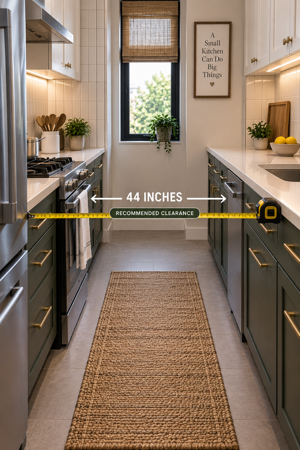
Corridor width is the real constraint in a small kitchen, and it's worth measuring before making a single decorating decision. A galley layout two parallel runs of cabinets is the most space-efficient configuration for anything under about 90 square feet, but it needs a minimum of 42 to 48 inches between the opposing counters. Below that, opening the oven and the fridge at the same time becomes a small negotiation with whoever else is in the room.
A single-wall layout works better than a galley in a genuinely tiny footprint, or in an open-plan space where you want the rest of the floor left clear. An L-shape is usually the better call when the kitchen opens directly onto a living or dining area, since it can wrap a corner without blocking the sightline through.
Decorating a bad layout just makes a bad layout look nicer. The same principle applies here as in any awkward living room → Your Layout Isn't the Problem. Your Walls Are. fix the actual function of the space first, then layer the visual improvements on top of it. A beautifully tiled kitchen with a 30-inch corridor is still a kitchen you have to turn sideways in.
Two-tone cabinets: the single highest-impact change
If you do only one thing from this entire post, this is the one.
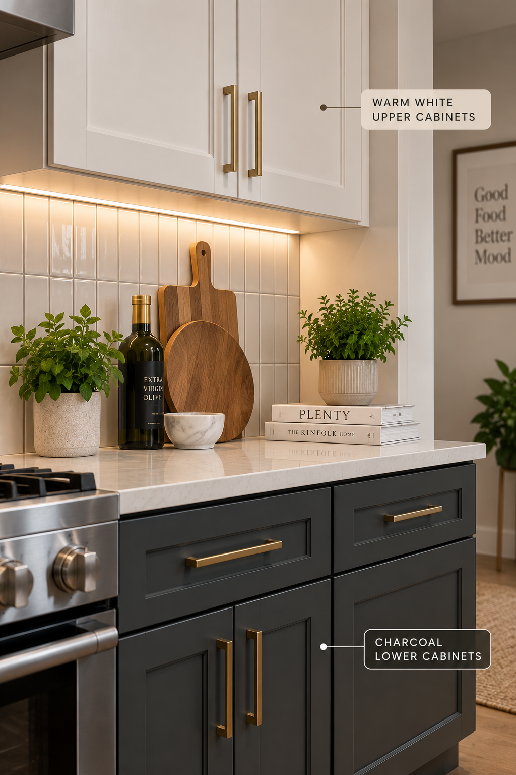
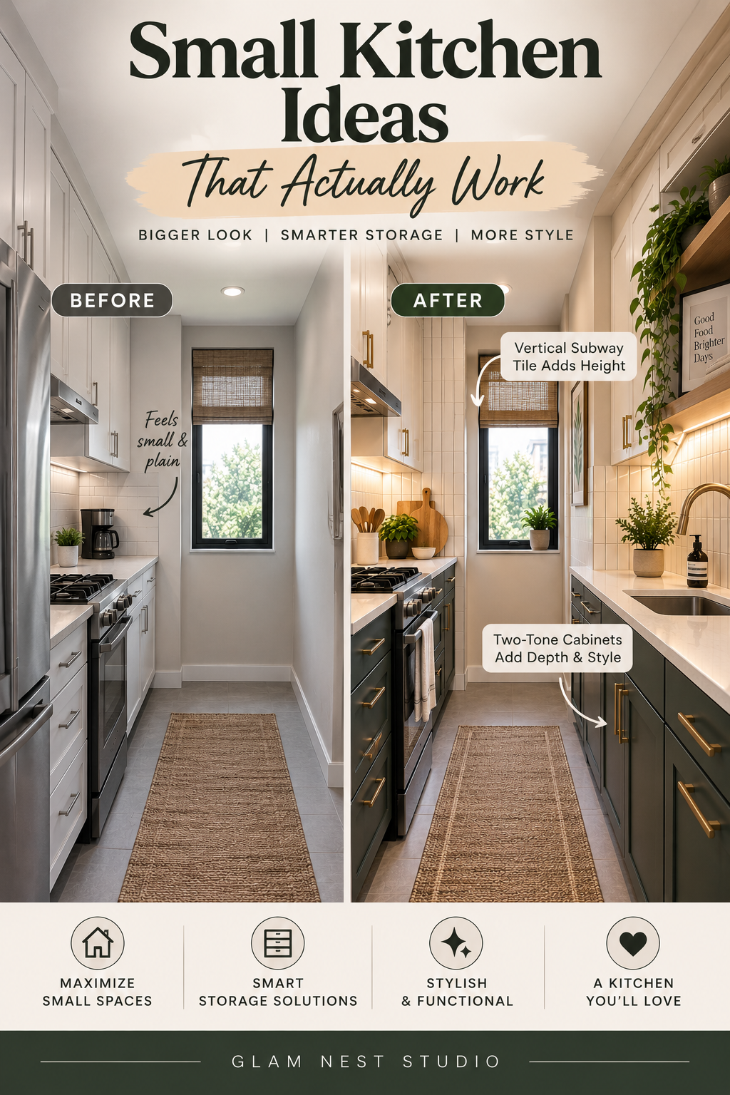
Darker lower cabinets, lighter upper cabinets. This exact pairing has seen an enormous jump in interest this year, and it isn't just an aesthetic preference the mechanism behind it holds up. Dark lower cabinets visually "ground" a room the same way a rug anchors a living room, while light upper cabinets recede and let the ceiling read as higher and further away. Reverse it light below, dark above and the effect flips, making the room feel like it's closing in from the top down.
A pairing that comes up again and again in current design coverage: a warm charcoal or deep navy on the lower cabinets against a warm white not a stark, cool white on the uppers, tied together with a single unified hardware finish, unlacquered brass being a common current choice. Warm whites read as considered; stark bright white reads as builder-grade default, which is exactly the flat, undifferentiated look most small kitchens are already stuck with.
If a full repaint feels like too much: cabinet refacing kits or peel-and-stick cabinet film can achieve a version of this same contrast without replacing doors or committing to permanent paint a sensible option for a rental, or a trial run before deciding on something permanent.
Vertical tile: the cheapest way to add height
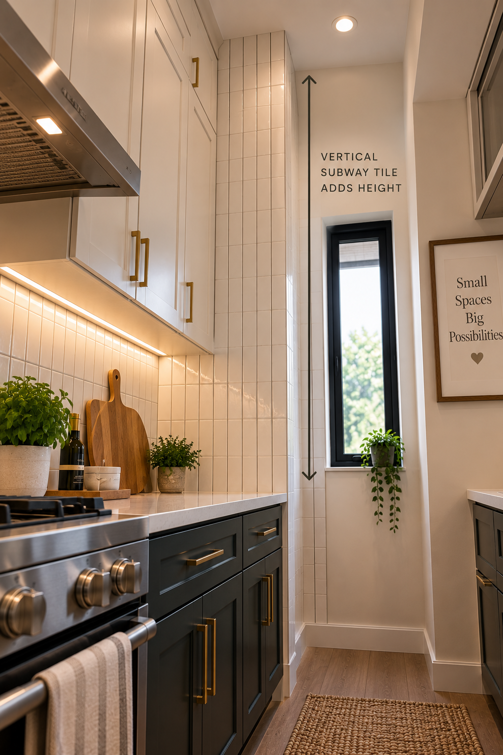
Standard subway tile laid in the usual horizontal running-bond pattern does its job fine. The same tile, rotated 90 degrees and laid vertically, does something the horizontal version can't: it pulls the eye upward, which reads as additional ceiling height without touching the actual ceiling at all.
The effect isn't subtle a vertical tile treatment can add the visual impression of well over a foot of extra height in a room where the actual ceiling hasn't moved an inch.
Where to use it: a backsplash is the obvious place, but running the vertical tile all the way to the ceiling instead of stopping at standard backsplash height pushes the effect further.
This doesn't require expensive tile. The pattern is doing the work, not the material cost. A basic white subway tile laid vertically achieves most of what a pricier tile would achieve laid the ordinary way.
Storage: go vertical, and hide most of it
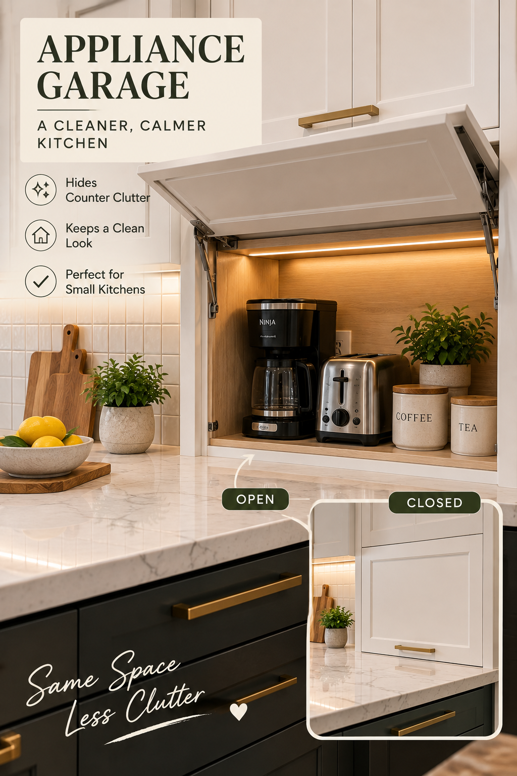
Small kitchens fail on storage in a specific, predictable way not enough cabinets, so counters end up covered in things that have nowhere else to go, which then makes the whole room read as cluttered regardless of how good the layout or colors are.
Use the wall space above standard cabinet height. The strip between the top of the upper cabinets and the ceiling is wasted in most small kitchens. Floor-to-ceiling cabinetry, or even just closed boxes up there for rarely used items, pulls the eye upward the same way vertical tile does, while genuinely solving a storage shortfall.
Keep what's visible closed, and give what's open a reason to be seen. Going fully open-shelf everywhere in an attempt to feel airy usually backfires every dish, mug and box of pasta becomes visible all the time, and a small kitchen with everything on display reads as chaotic no matter how nice the shelves themselves are. The same "visible things should earn their visibility" principle from any small space → How to Lay Out a Long, Narrow Living Room applies directly: open shelving on one wall only, reserved for a handful of genuinely nice pieces, everything else behind a closed door.
An appliance garage a cabinet with a roll-down or lift-up door specifically for countertop appliances solves the single biggest daily clutter source in most kitchens: the toaster, the coffee maker, whatever else permanently lives on the counter. A corner appliance garage cabinet reclaims real counter space without adding a single new cabinet box.
Mixed metal finishes, deliberately
A small kitchen where every metal finish matches exactly all chrome, all brass, all black can end up looking just as flat as an all-one-color kitchen. One dominant metal used with intention is fine, but a small, deliberate amount of variation a brass faucet against black cabinet hardware, say adds the same depth-through-contrast effect as the two-tone cabinets.
This is the same repetition-not-matching principle that applies to any room → Does Furniture Have to Match? one dominant metal, with a second appearing on purpose rather than everything forced into total uniformity.
Light, and why the ceiling fixture alone isn't enough
A small kitchen lit by one central overhead fixture has exactly the same problem any room does under a single ceiling light → 10 Common Home Decor Problems it flattens everything and kills the shadow that gives a space depth.
Under-cabinet lighting does more for a small kitchen than almost any other single change on this list. It lights the actual work surface, adds a warm glow at counter height a ceiling fixture can't replicate, and creates the layered light-and-shadow effect that makes a flat room feel dimensional.
Pendant lights over an island or peninsula, if the kitchen has one, do double duty as task lighting and a focal point the same focal-point principle that applies to any room without one → Living Room Focal Point: Why Your Room Feels Unfinished.
What to avoid
Going all-white because it photographs well. It's the single most common mistake in small kitchens. White reflects light, which genuinely helps, but an all-white kitchen with zero tonal contrast anywhere still reads as flat, regardless of how much light is bouncing around inside it.
Open shelving on every wall. Feels airy in theory, reads as cluttered in practice, for the reasons above.
Trying to fix the layout with decor. Paint and tile can't compensate for a corridor too narrow to comfortably work in. Measure the actual clearances before doing anything else.
Matching every single metal and cabinet tone. The uniformity that feels "clean" is often the exact thing making the room feel flat. Some deliberate contrast is doing real work, not just looking nice.
Where to start, cheapest to most involved
- Under-cabinet lighting. Cheapest change on this list with real functional and visual impact.
- Repaint the lower cabinets in a deeper tone, leaving the uppers lighter.
- Add an appliance garage or closed storage for whatever currently clutters the counter.
- Vertical tile, if a backsplash update is already on the list.
- Floor-to-ceiling storage, if a fuller renovation is on the table.
None of these require gutting the kitchen. The cabinet repaint and the under-cabinet lighting, done together over a single weekend, did more for that 61-square-foot kitchen than everything I'd bought for it the year before.
The short version
A small kitchen doesn't need to be bigger. It needs contrast between cabinet tones, between visible and hidden storage, between one flat overhead light and several layered ones. Fix the actual layout and clearances first, then add the visual depth on top.
Most of it costs less than the appliances people buy trying to solve the same problem the wrong way.
Affiliate Disclosure
Some links in this post are affiliate links. If you buy something through one, GlamNestStudio may earn a small commission it doesn't cost you anything extra. I only link to things I'd recommend to a friend, and I've used or genuinely researched everything mentioned here. It's what keeps the guides on this site free.
Before you go
More on making small spaces work harder kitchens, living rooms, and the rest of the décor guides on GlamNestStudio.